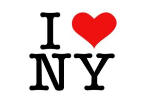
Earlier this week I wrote a LinkedIn post about the timelessness of the “I Love NY” logo. As I wrote, the logo was designed by Milton Glaser, arguably one of the greatest graphic designers in the last 60 years.

His work, which spans publishing, art, music, retail, and more, has touched our lives in ways we may not even realize. One of his best-known works, besides the “I Love NY” logo, is the poster he designed in 1967 to accompany the Bob Dylan Greatest Hits album. The poster depicts Dylan in black silhouette with streams of psychedelic colors as his hair. No doubt, over the years, this poster has adorned thousands of college dorm rooms.
So, back to the “I Love NY” origins story. In the 1970s, New York City had fallen on hard times. Crime was rampant, and by 1975 the city was going bankrupt and asking for federal assistance. President Ford denied to provide assistance, which was famously reported in a NY Daily News headline, “Ford to City: Drop Dead”.
As if that wasn’t enough, in 1977 there was a widespread blackout across the metropolitan area, leading to extensive looting and arrests. Visitors stayed away from the city and tourism declined. It was clear something needed to be done to bring people back. In a desperate move, the New York State Department of Economic Development engaged the advertising firm of Wells Rich Greene to develop a campaign to reignite NYC tourism.
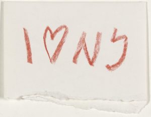
After the slogan “I Love NY” was developed, Wells Rich Greene needed a logo for the campaign. They hired Glaser, a very talented designer who was most known for the Bob Dylan album cover. Glaser had considerable experience in publishing, but little experience with advertising campaigns. At his first meeting with the agency, Glaser pulled out a crumpled paper torn from the back of an envelope. On a recent cab ride, he had sketched his idea for the logo with a red crayon. It resonated with the team and became the logo we are all familiar with today.

“I Love NY” went on to become the most successful tourism campaign in the country, generating enormous revenue for the state and winning several awards. Glaser never imagined the logo would last over time. Indeed, he said, “It is amazing to me that it has not vanished, that it is still impactful, that people still respond to it, and it still seems to do its basic job. Perhaps the most remarkable thing about it is not its origins, but its persistence.” Clearly, something about the now iconic logo resonated not only with visitors to the city, but with hardcore New Yorkers as well.

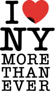
Years later, after the tragedy of 9/11, Glaser, devastated by the attacks, re-imagined the logo and once again tapped into the deep love and pride New Yorkers have for their city. Glaser added the words, “more than ever” to the logo and showed the heart as being singed on the lower left. The logo was so powerful that the NY Daily News printed it on both front and back page of the newspaper. Once again, with great empathy, Glaser had reached into his own emotions and expressed the sentiments all New Yorkers were feeling.

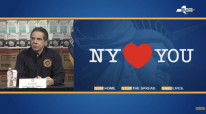
Fast forward to the COVID-19 crisis we are all facing. Although I’m uncertain as to whether Milton Glaser had any involvement, the “I Love NY” logo has once again been repurposed to convey a message of empathy and hope. During one of Governor Cuomo’s recent press conferences, he showed a PowerPoint slide that said, “NY Loves You”.

When I saw this on TV, it occurred to me how great design can be timeless. The simplicity of the design and the purity of the message have become a beacon of hope for us and promises a better future. “I Love NY” stands as testament to how graphic design can be human-centered and empathetic.
And isn’t that what we all need right now?